Designers
Component library
Last updated 2 November 2026
Every Insites web component, grouped by what you use it for, each with a live demo.
The Insites web components are custom HTML tags that work on any page, with no build step. They are grouped below by what you use them for: actions, form fields, structure, data and feedback. Each page has a live demo, every attribute and every event.
New to the library? Start with Getting started to load it on a page. The icons the components use are on Font Icons.
Actions
Buttons, menus and controls that start an action or change what is shown.
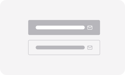 Buttons
ins-button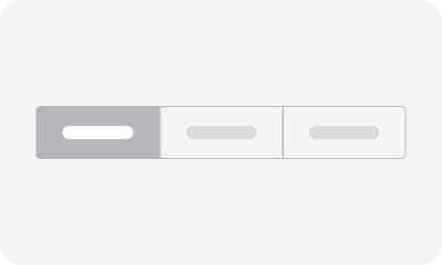 Button Group
ins-button-group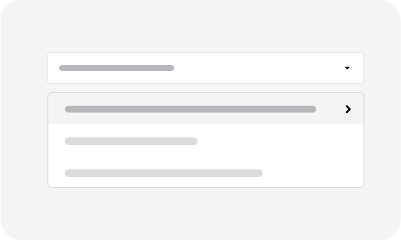 Dropdown
ins-dropdown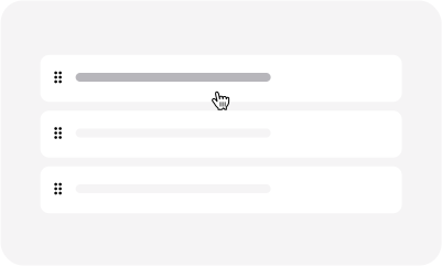 Sort
ins-sort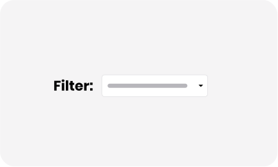 Filters
ins-filter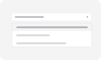 Filter Items
ins-filter-item
Form fields
Inputs, selects, pickers and editors that collect a value.
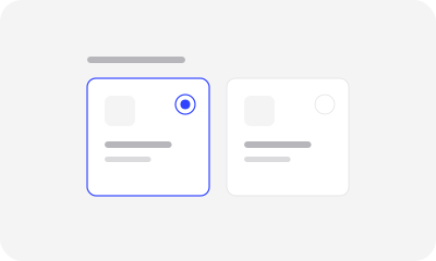 Card Select
ins-card-select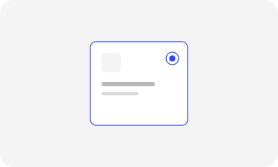 Card Select Option
ins-card-select-option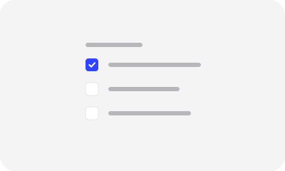 Checkbox Group
ins-checkbox-group Checkbox
ins-checkbox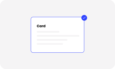 Check Card
ins-checkbox-card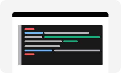 Code Editor
ins-code-editor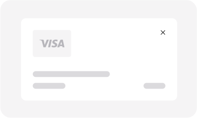 Credit Card
ins-credit-card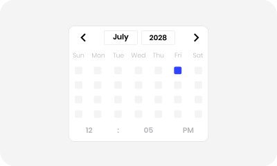 Date and Time
ins-date-time Image Picker
ins-image-picker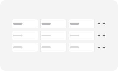 Input Table
ins-input-table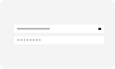 Input
ins-input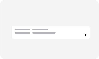 Multiple Input
ins-input-multiple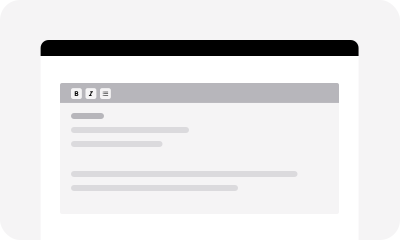 Markdown Editor
ins-markdown-editor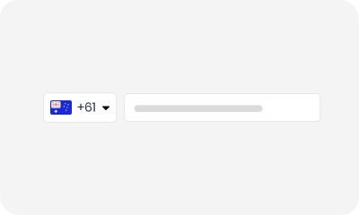 Phone
ins-input-phone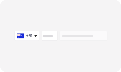 Tel
ins-input-tel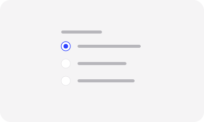 Radio Group
ins-radio-group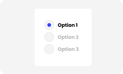 Radio
ins-radio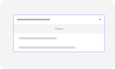 Input Select
ins-input-select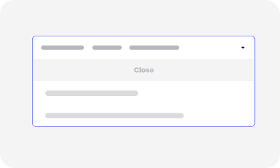 Input Select Option
ins-input-select-option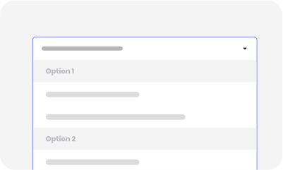 Input Select Group
ins-input-select-group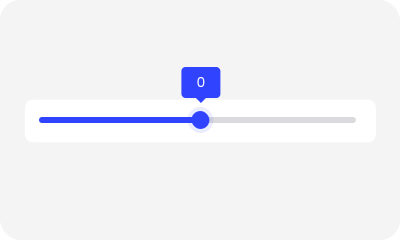 Slider
ins-input-slider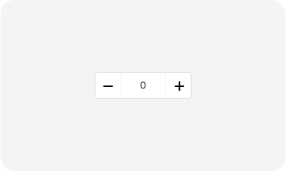 Stepper
ins-input-stepper Switch
ins-toggle-switch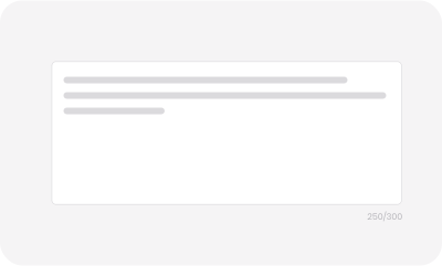 Textarea
ins-textarea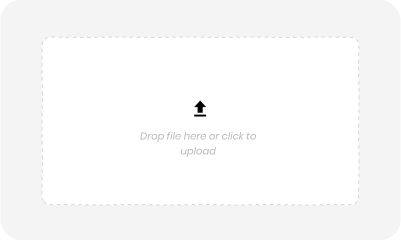 Upload
ins-input-file WYSIWYG Editor
ins-editor Button Select
ins-button-select Button Select Option
ins-button-select-option Button Select Group
ins-button-select-group Input Search
ins-input-search
Structure
Cards, tabs, headers, sidebars and other pieces that lay out a page.
 Carousel
ins-carousel Gallery
ins-gallery Heading
ins-heading WrappersLayout classes
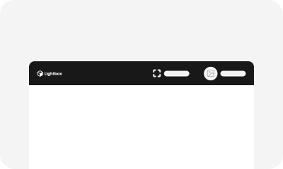 Header
ins-header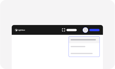 Header User
ins-header-user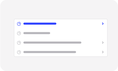 Sidebar
ins-sidebar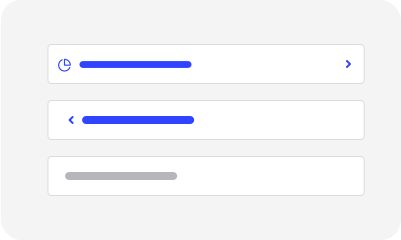 Sidebar Item
ins-sidebar-item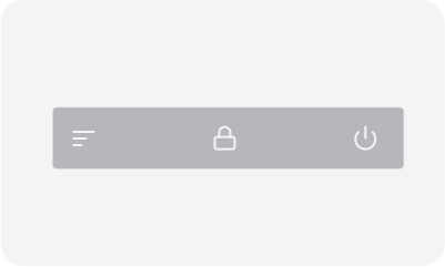 Sidebar Footer Menu
ins-sidebar-footer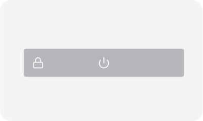 Sidebar Footer Button
ins-sidebar-footer-button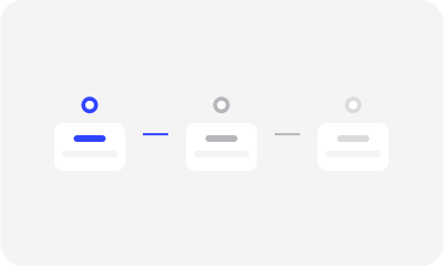 Steps
ins-steps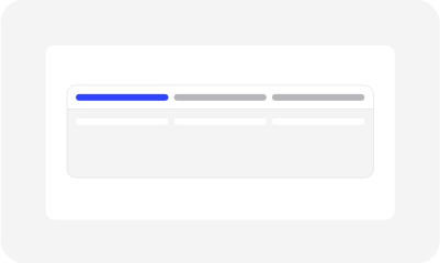 Tabs
ins-tab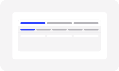 Tab Items
ins-tab-item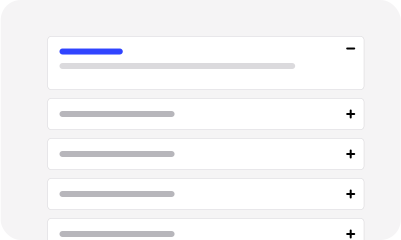 Accordion
ins-accordion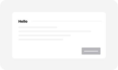 Card
ins-card
Data
Tables, charts, tags and timelines that show records and numbers.
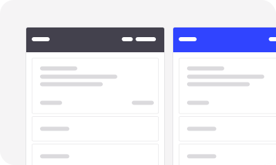 Kanban Board
ins-kanban-board Charts - Bar
ins-bar-chart Charts - Line
ins-line-chart Charts - Pie
ins-pie-chart Charts - Sparkline
ins-sparkline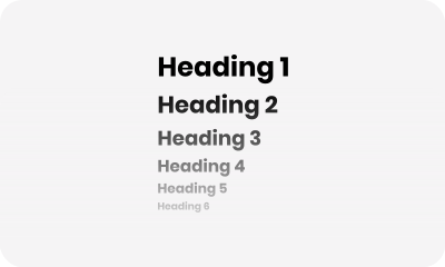 Markdown
ins-markdown Progress Bar
ins-progress-bar Info Table
ins-info-table Table
ins-table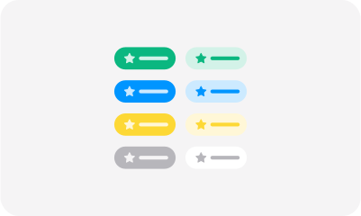 Tag
ins-tag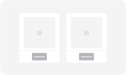 Thumbnails
ins-thumbnail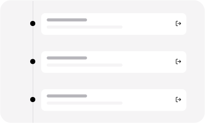 Timeline
ins-timeline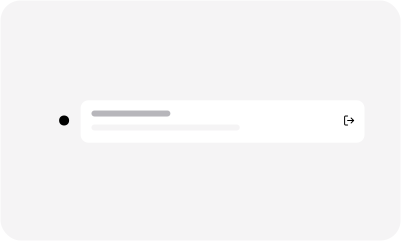 Timeline items
ins-timeline-item
Feedback
Modals, drawers, alerts, tooltips and loaders that respond to the reader.
 Loader
ins-loader Alert Box
ins-alert-box Drawer
ins-drawer Modal
ins-modal Backdrop
ins-backdrop Tooltip
ins-tooltip
Reference only
These 22 components ship in the library but have no page of their own yet. Most of them are parts that you place inside a documented component, such as the items of an accordion or the cards of a Kanban board. Their attributes are listed in the library source.
ins-accordion-itemins-accordion-linkins-breadcrumbsins-chartins-dropdown-itemins-gallery-imageins-input-search-optionins-input-tooltipins-instancesins-instances-itemins-instances-sub-itemins-kanban-cardins-kanban-columnins-notificationsins-notifications-itemins-rendererins-selectins-select-groupins-select-optionins-sidebar-footer-menuins-stepins-styleguide
Seven more folders in the library source (ins-accordion-item-heading, ins-admin, ins-content, ins-page, ins-table-row, ins-table-td and ins-table-th) are internal parts that the website line does not load on their own.