Design system
Design System Overview
Last updated 10 November 2026
The Insites Design System is a collection of reusable components, guided by clear standards used to assemble together and build any number of applications.
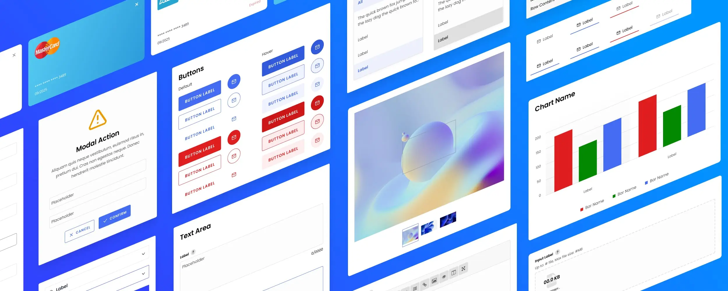
What is the Insites Design System?
The Insites Design System is a collection of reusable components, guided by clear standards used to assemble and build any number of applications.
What are the benefits of a Design System?
- Provides a single source for building User Interfaces (UI) – developers recognize the UI, even when the requirements are different for different clients.
- Saves you time and money in the long term – by streamlining the process of initialising a website or application.
- Increases the consistency – helps users feel comfortable using the system.
- Decreases time spent on maintaining the code base – enables us to support the application for a lower cost than if it were not based on a design system.
- Focuses teams on experience and implementation – more time can be spent developing a positive user and customer experience, and adopting widespread implementation.
What you need to start using the Insites Design System
Log in to your Figma account and duplicate the Insites Design System Community file.
Download and install the Insites Font Icons.
Download and install the Open Sans font.
Customizing Components
All of our Figma components use a Master Component as the base for all variants.
Updating the Master Component will automatically apply the changes to all variants except where overrides were already added.